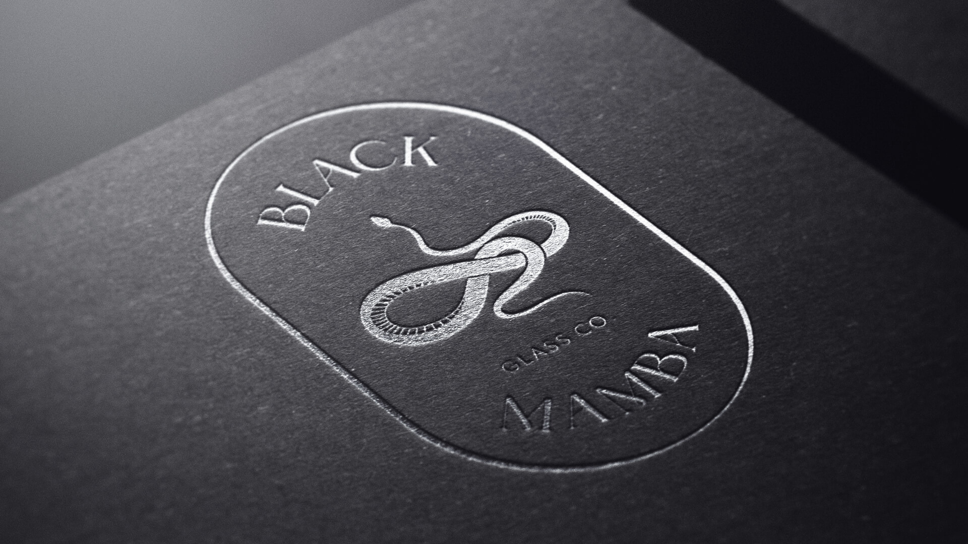
A self-taught stained glass artist turning her craft into a business. She needed a brand as bold as her work, and practical enough to use everywhere she sells.
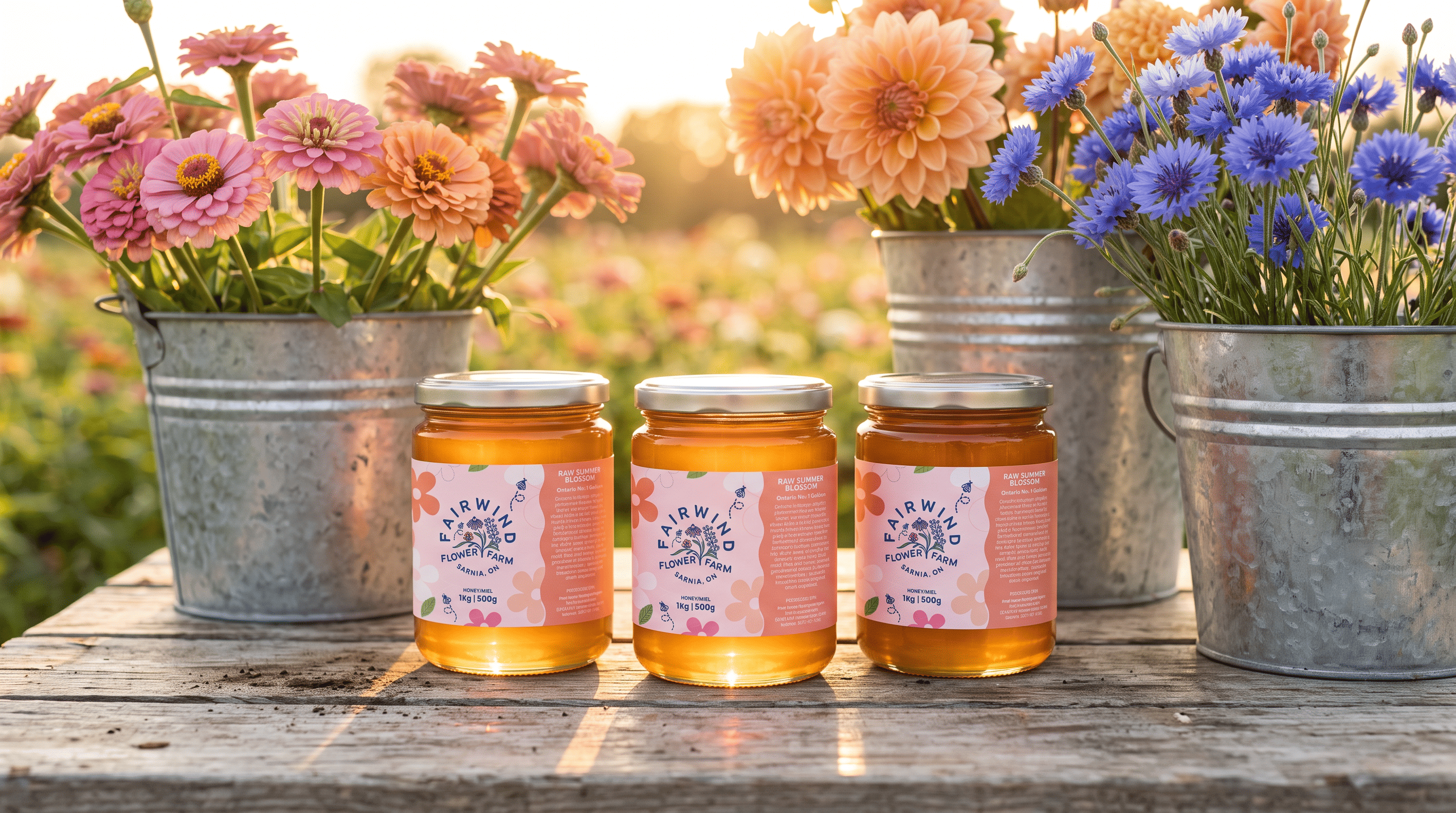
A family flower farm and apiary with six different ways to buy, from wedding flowers to honey. It needed its first real brand: one that could hold everything together and still feel like the farm.
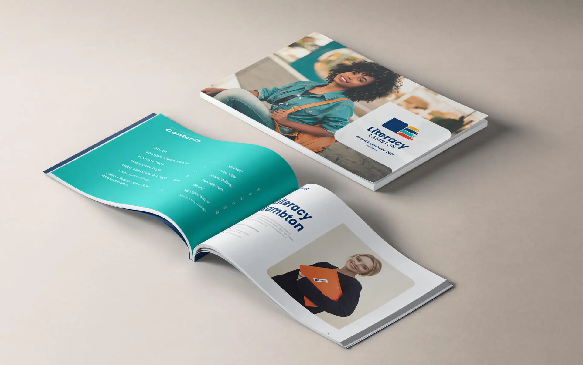
A long-running non-profit offering free literacy programs across Lambton County. It needed a rebrand that felt bright and welcoming, and was easy to read for learners at every level.
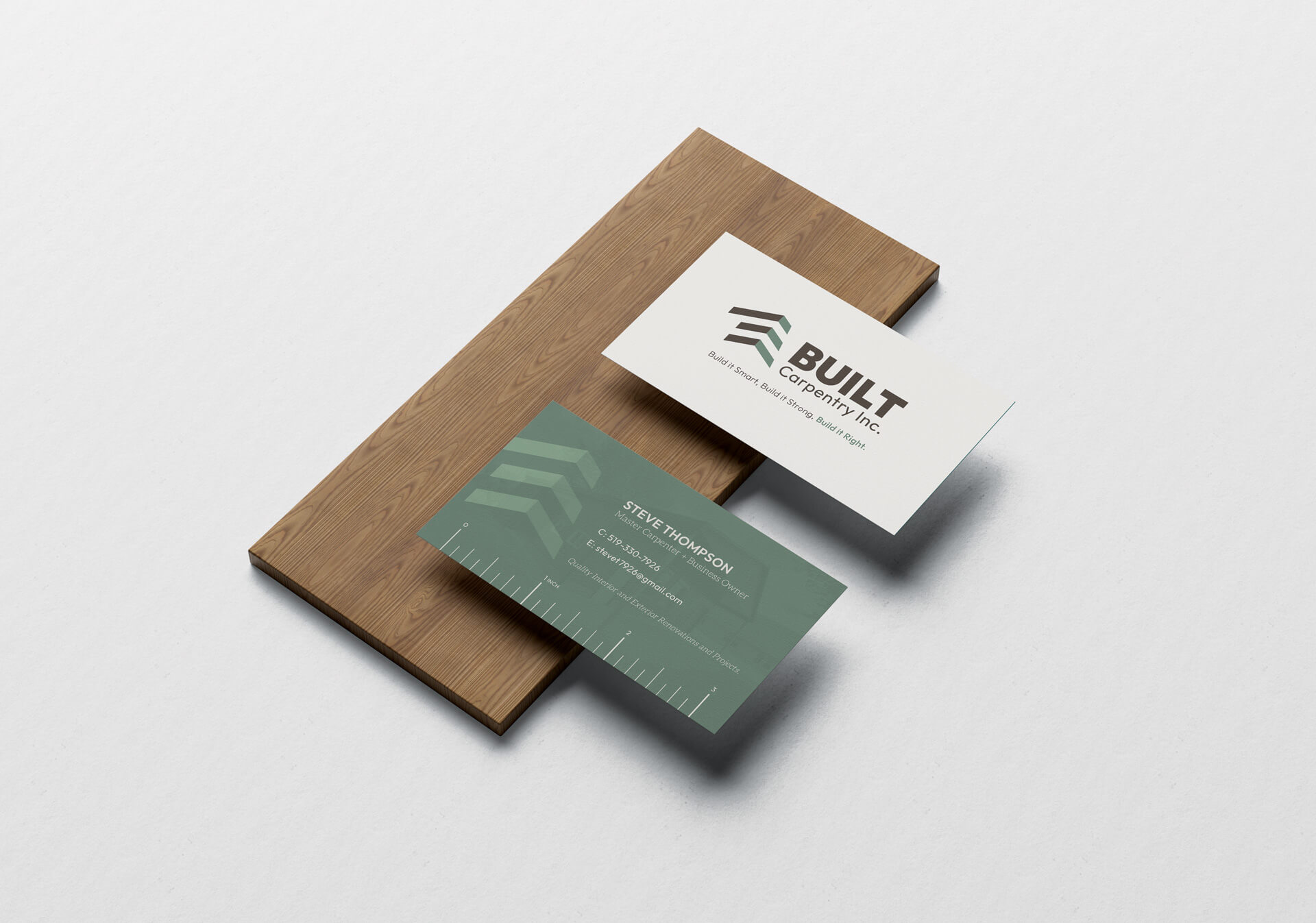
A local carpentry company doing premium work, from kitchens to custom outbuildings. It needed its first brand: one that looked as solid and well made as everything it builds.
A mechanical design consultancy with a long list of services and no brand yet. It needed one mark that could hold it all together and show where the company comes from.
A University of Toronto program that brings students from every healthcare discipline together to learn about pain. It had been running for years without a real brand, and needed one that showed what makes it different.
A sustainable Canadian clothing brand with a strong look but no rules to keep it consistent. I set up the guidelines and carried the brand into packaging, print and social.
A cabin rental company that had grown from a local service into a booking platform across Western Canada. Its DIY brand no longer matched the experience, and it needed one that felt as special as the stays it offers.