Literacy Lambton

The Organization for Literacy in Lambton, known as Literacy Lambton, is a non-profit that offers free programs to adults across Lambton County. Learners come to build skills in basic math, reading, writing and computers, often to get a job, earn a credential or handle everyday life with more confidence.
Their existing brand no longer reflected the organization they’d become. They came to me for a full rebrand: something bright and engaging that showed what a positive learning environment Literacy Lambton is.
The challenge
Most brands need to speak to one audience. Literacy Lambton needed to speak to four, and they want very different things.
For an adult learner, deciding to go back to basic skills can take real courage. The brand had to feel warm and approachable, never like school or a form to fill out. Volunteers needed to see an organization they’d be proud to give their time to. Funders and community partners needed to see a credible, well-run organization worth investing in.
There was a bigger challenge underneath all of that. A literacy brand that’s hard to read misses the point. Many of the people Literacy Lambton serves find reading difficult, so accessibility couldn’t be a final check at the end. It had to shape every decision from the start.
What I did
- Logo
- Colour palette
- Typography
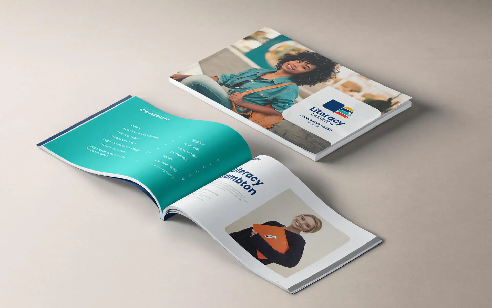
- Brand guide
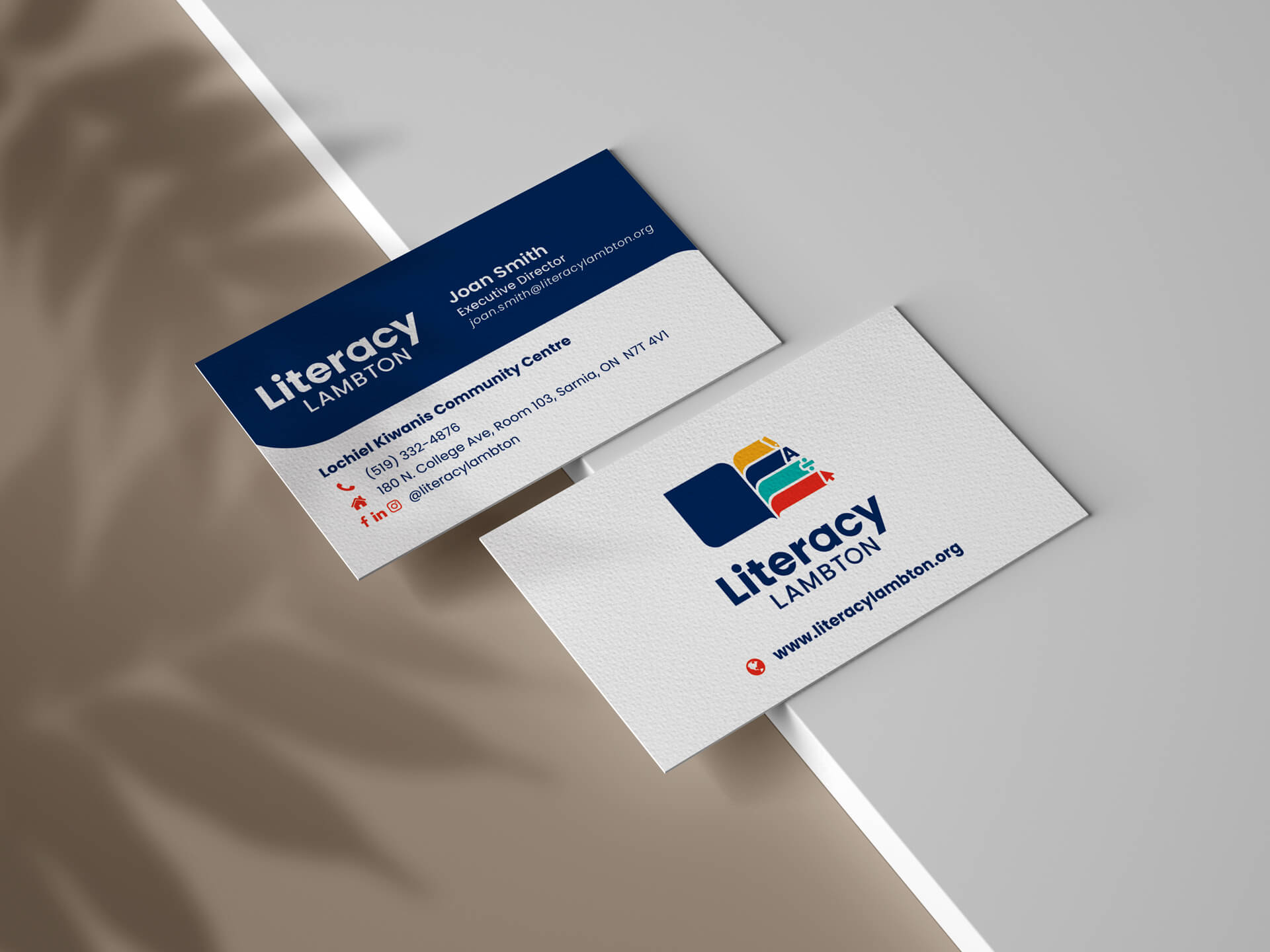
- Business cards
- Brochures
- Signage
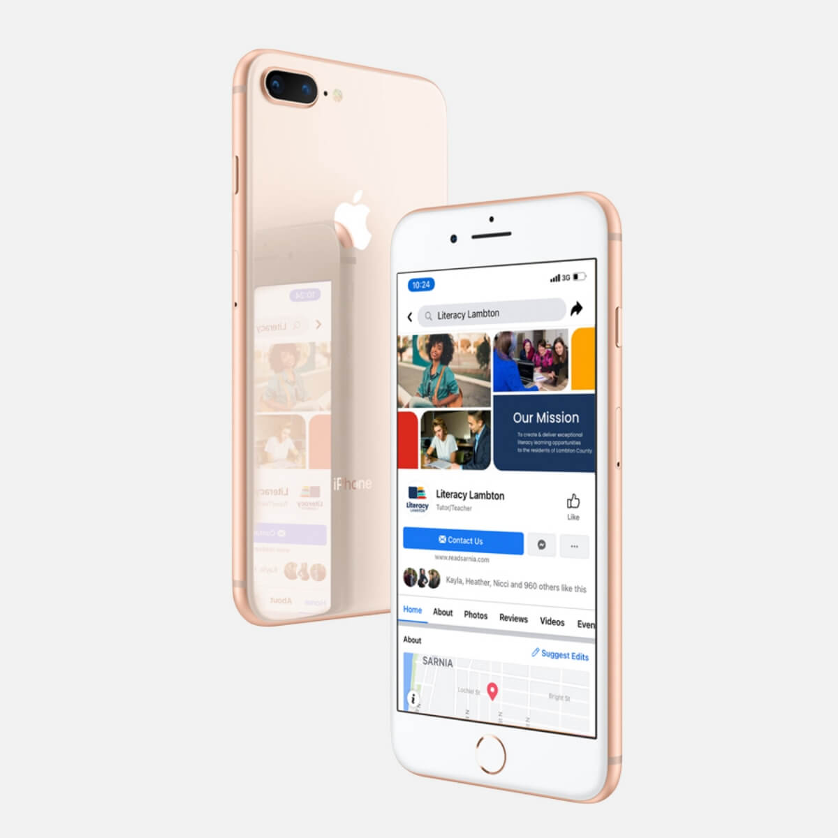
- Social media templates
The solution
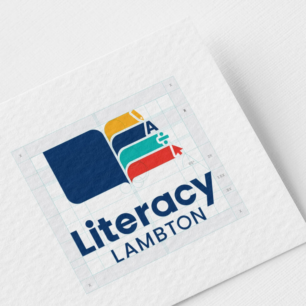
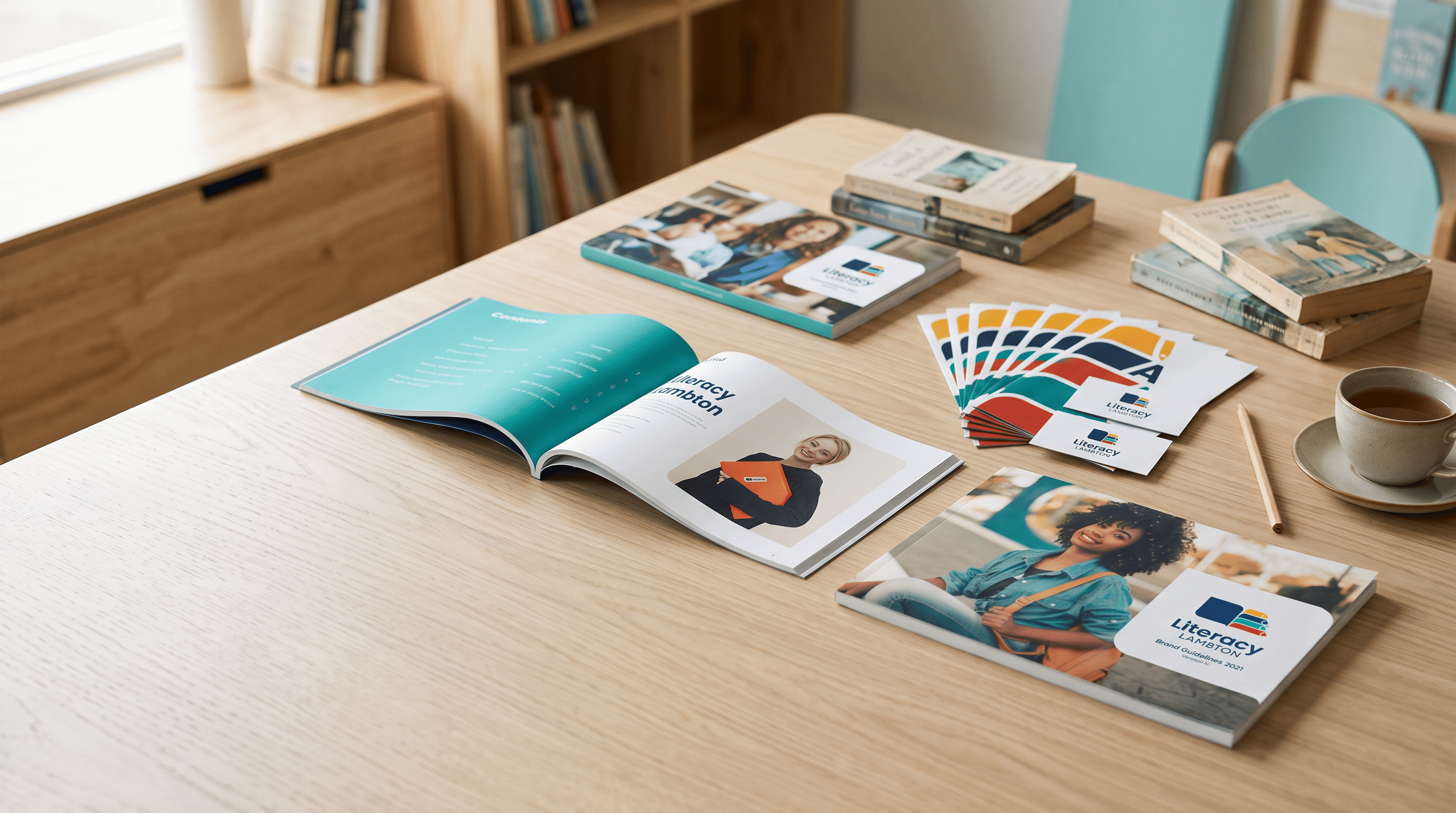
The new logo has two parts. A book icon stands for knowledge and growth, and the wordmark beside it feels steady and supportive. It’s friendly enough for a nervous first-time learner and solid enough for a grant application.
The colour palette is built around the work itself, with one colour for each program area: math, reading, writing and computers. That gives the brand its bright, engaging feel, and it does a practical job too. Each program gets its own colour, so learners and partners can quickly see which materials go with which program, while everything still clearly belongs to Literacy Lambton.
Accessibility shaped every choice. The typeface is dyslexia-friendly, chosen so the brand is easy to read for the people it exists to serve. It’s the same approach throughout: if a design choice made the brand harder to read, it didn’t make the cut.
From there, I carried the brand across everything Literacy Lambton uses to reach people: brochures for learners and partners, signage for their space, business cards and social media templates. The brand guide ties it all together, showing how to use the logo, colours and type so the brand stays consistent as it’s used.
Value delivered
In 4 to 6 weeks, Literacy Lambton went from a brand that no longer fit to a complete identity that works for every audience it serves: welcoming to learners, inviting to volunteers and credible to funders and partners.
With a brand guide and templates in place, staff and volunteers can create new materials without starting from scratch. Every brochure, sign and post looks like it comes from the same organization, which matters when you’re asking people to trust you with something as personal as learning to read.
Our final product exceeded our expectations. The branding kit would easily rival the professional quality you would expect from a full-service agency.