Interfaculty Pain Curriculum

The Interfaculty Pain Curriculum (IPC), known to students as “Pain Week,” is an educational program from the University of Toronto’s Centre for the Study of Pain. It brings together students from across the healthcare disciplines to learn how to assess and manage pain as a team, with patients at the centre of care.
The program had been running for a long time, but it had never had a real brand. They came to me for a complete identity, a website, and the materials to support the program.

The challenge
IPC is built on a big idea: pain care works best when every discipline learns together. But without a brand, there was nothing that showed that idea at a glance. The program needed an identity that could speak to students from many different faculties, to the educators running it, and to the university promoting it, while keeping patients at the centre of the story.
The website had a lot of practical work to do. Students and faculty both needed to find the course curriculum quickly, and there was a library of resources to organize, including videos and white papers. It had to share information clearly with two very different audiences without becoming cluttered.
And like most university projects, it had to bring a group along. A small committee and several rounds of stakeholder approvals meant the brand needed a clear rationale behind every decision, so it could earn agreement rather than just win on taste.
What I did
- Logo and brand identity
- Website design and development
- Brochure
- PowerPoint presentation decks
- Merchandise
The solution
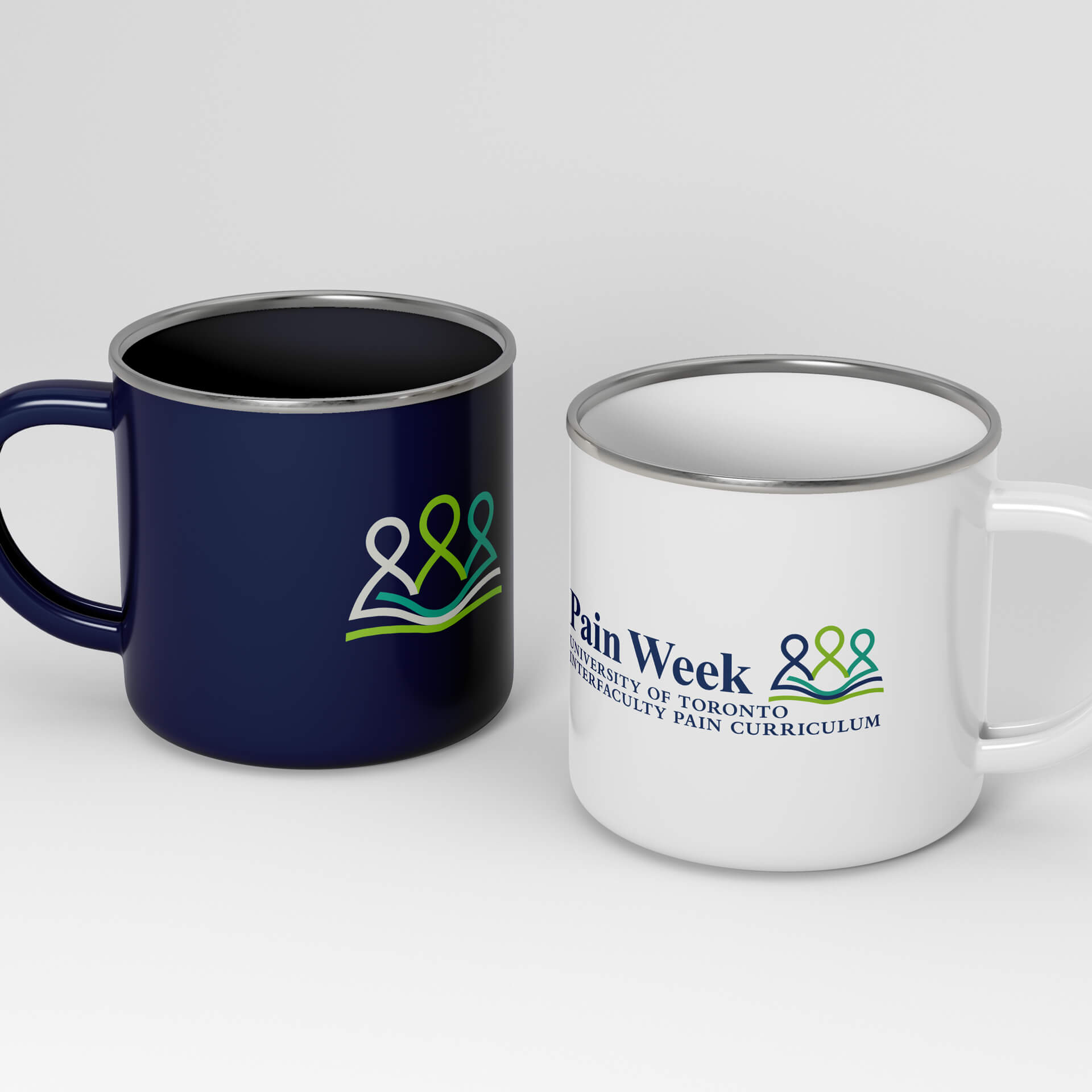
The logo puts IPC’s core idea into one mark. Three interwoven figures represent the healthcare community the program brings together: health and social care providers, educators, and, at the heart, the patients. Flowing pages of a book wrap through the figures to represent the shared learning that makes the program work. It shows, at a glance, that this is about different people learning together, with patients at the centre.
Because the brand had to earn agreement from a committee, every choice came with a clear reason behind it. That made the approval rounds about whether the brand did its job, not about personal preference.
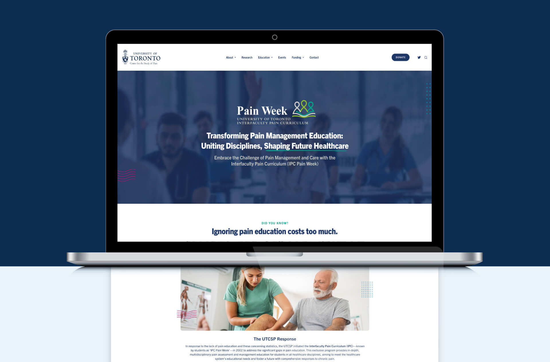
I designed and developed a six-page website to be the program’s home base. It brings together the course curriculum, a resources section with videos and white papers, and key information for students and faculty, organized so each audience can quickly find what they need.
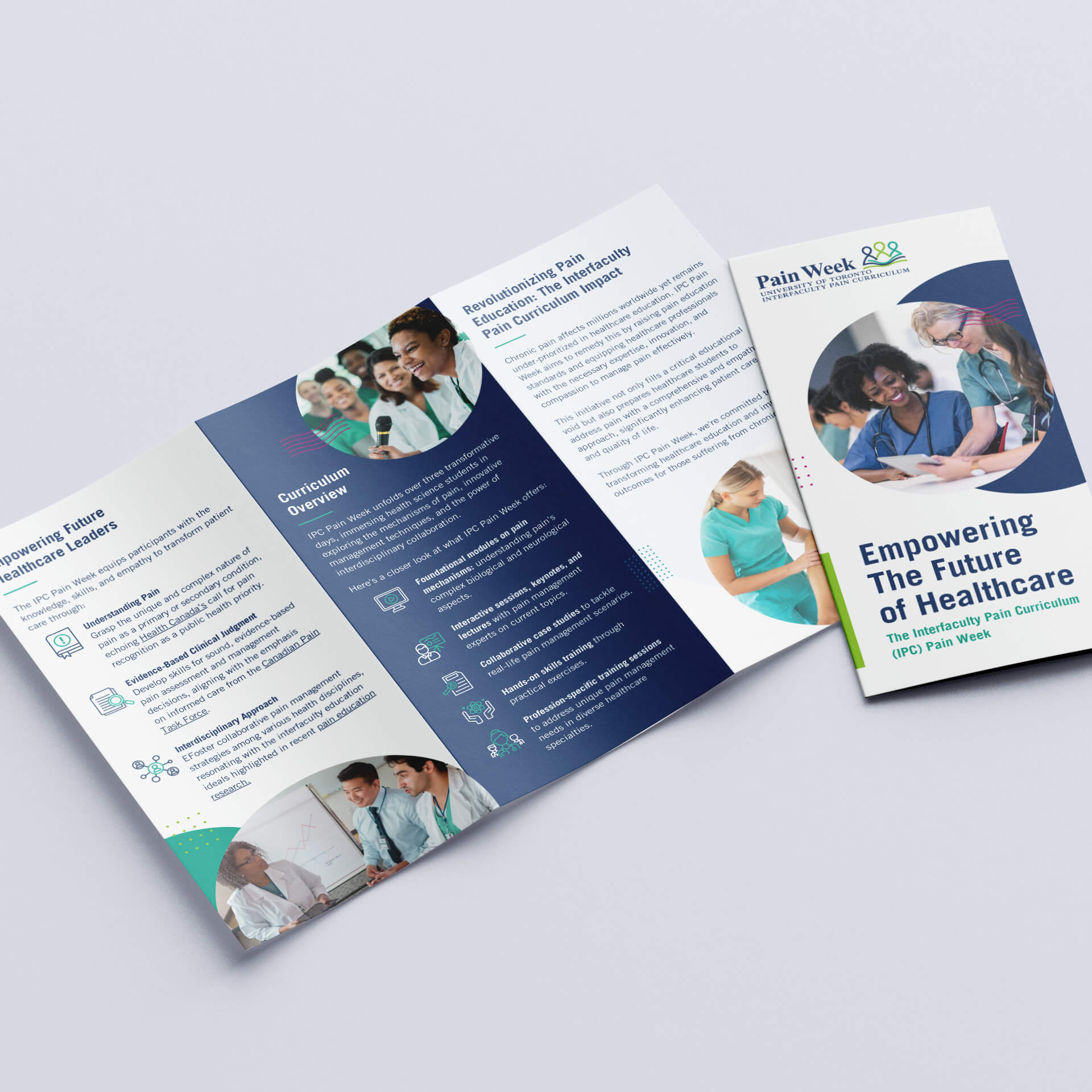
From there, the brand carried into the materials the program uses every day: a brochure to introduce IPC, PowerPoint decks for presenting and teaching, and merch like mugs that give the program a visible presence around campus.
Value delivered
After years of running without a real brand, IPC now has a complete identity that tells its story clearly: an interdisciplinary program built around patients.
Students and faculty have one place to find the curriculum and resources, and the university has a professional, consistent brand to promote the program with. From the website to the presentation decks, everything now looks and sounds like it comes from the same program.