Redwood Cabins

Redwood Cabins started as a cabin rental service in northern British Columbia and grew into a full booking platform for cabin stays across Western Canada, from pet-friendly and eco-friendly cabins to glamping retreats.
The business had grown fast, but the brand hadn’t kept up. They came to me for a rebrand, and I led the project from start to finish as project manager, art director and designer.
The challenge
The old brand looked DIY and generic, and that was a real problem for a business selling something special. People booking a glamping retreat or a cabin in the woods are buying an experience, and they judge it long before they arrive. A generic logo makes a unique stay look like any other rental.
The new brand had to do two things at once. It needed to honour Redwood’s roots in the Canadian wilderness, and it needed to show the upscale, nature-focused side of what they offer, the wellness-meets-outdoors feel that sets a great cabin stay apart.
To get that balance right, I started with research. I looked at other brands in the space to see where Redwood could stand apart, at the owners’ backgrounds and passions to find what was genuinely theirs, and at the audience to understand who is drawn to this style of outdoor experience, like glamping.
What I did
- Brand strategy and research
- Logo
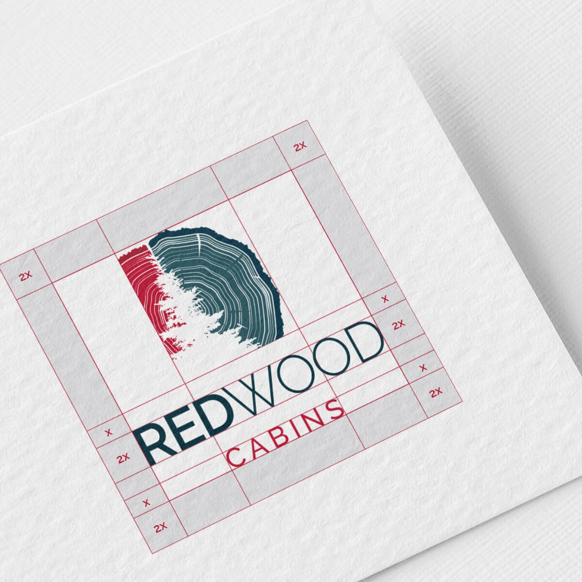
- Brand guidelines
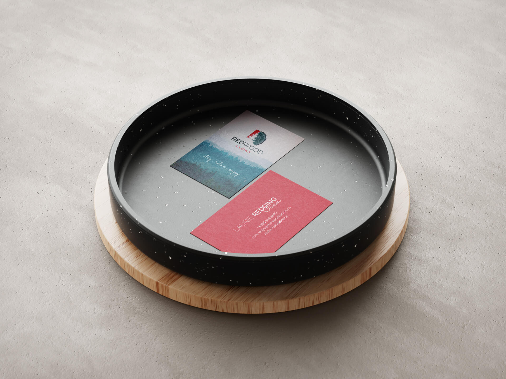
- Business cards
- Welcome brochures
- Project management and art direction
The solution
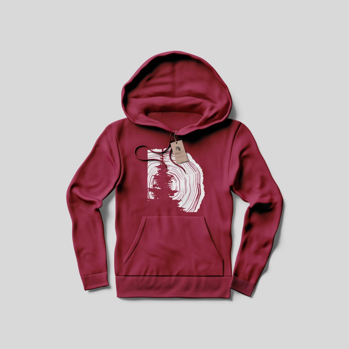
The research shaped every visual choice. The new mark uses the silhouette of a pine tree, built from the lines of a tree trunk. It’s simple, distinctive and rooted in the landscape Redwood is known for, without falling back on the cartoon cabins and generic mountains that are everywhere in this space.
The typography sets the upscale tone. Raleway, an elegant sans-serif, leads, with Sacramento, a flowing script, used sparingly as an accent for headlines. Together they feel refined and relaxed, closer to a boutique retreat than a budget rental.
The colour palette carries both sides of the brand. A deep wilderness blue speaks to the calm, comforting side of a cabin stay, and a vibrant burnt red brings in the sense of adventure. Between them, the brand feels cozy and outdoorsy at the same time.
From there, I carried the brand into the pieces guests and partners actually see: business cards, and welcome brochures that greet guests and set the tone for their stay. The brand guidelines tie everything together so the brand stays consistent as the platform keeps growing.
Value delivered
In 4 to 6 weeks, Redwood Cabins went from a DIY, generic look to a distinctive brand that finally matches the experience they offer.
The new identity shows both sides of the business, its wilderness roots and its upscale, wellness-focused stays, so guests get a sense of what makes a Redwood cabin special before they book. With the guidelines in place, the brand can grow with the platform across Western Canada.