Myriad Conceptions Inc.

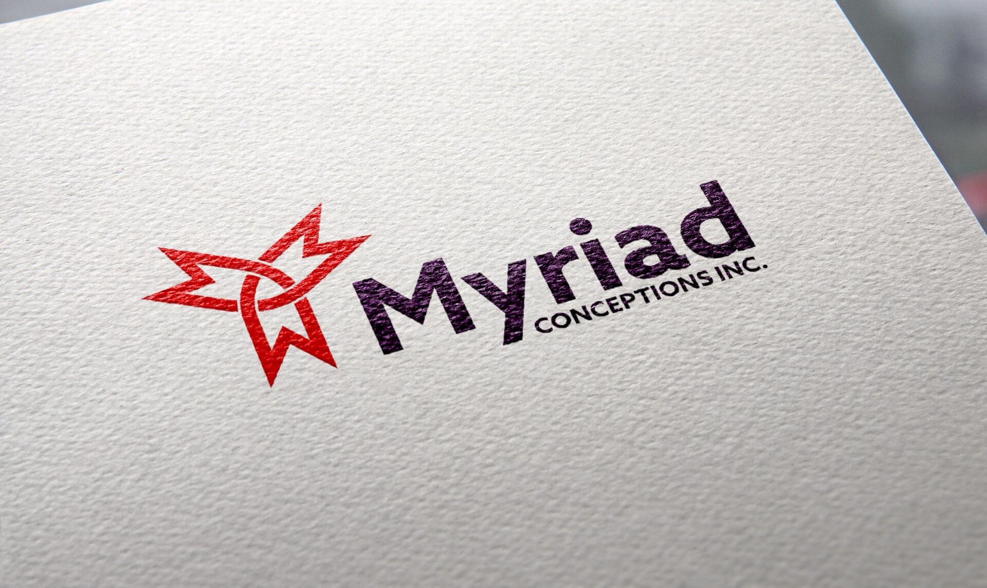
Myriad Conceptions Inc. is a mechanical design consultancy based in Ontario, offering a broad range of design services across many different kinds of projects. The name says it best: they do a myriad of things.
They came to me for their first brand. They wanted it to represent the full range of what they do, and they wanted their Canadian roots to come through clearly.
The challenge
A business that does many things has a tricky branding problem. Try to show every service and the logo gets busy and forgettable. Pick just one and you undersell everything else. The mark needed to say “range” without trying to list it.
The Canadian side came with its own risk. The easy answer is to drop a flag or a generic maple leaf beside the name, and that can feel tacked on. Myriad’s roots needed to be part of the mark itself.
It also had to feel right for the work. Mechanical design is about precision, and clients hiring a design consultancy are looking for someone careful and exact. A loose or decorative mark would send the wrong signal.
What I did
- Logo
- Colour palette
- Typography
- Brand guidelines
- T-shirt design
The solution
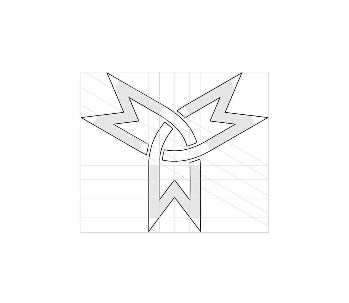
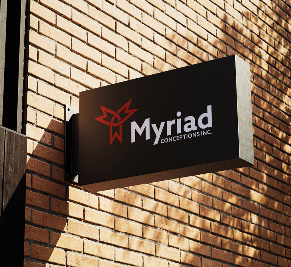
The idea came straight from the name. Myriad means many, so I built the icon from more than one M. Three stylized M’s come together in a clean, three-pointed shape, so the many services sit inside one mark without anything needing to be spelled out.
That same shape answers the second part of the brief. They’d asked for their Canadian roots to come through, so I designed the arrangement so that, together with the colour palette, the three M’s form a subtle maple leaf. It isn’t added on beside the name. It’s built into the structure of the mark, and once you see it, you can’t unsee it.
The lines are clean and geometric on purpose. Mechanical design is precise work, and the mark reflects that: balanced, exact and professional, without decoration getting in the way.
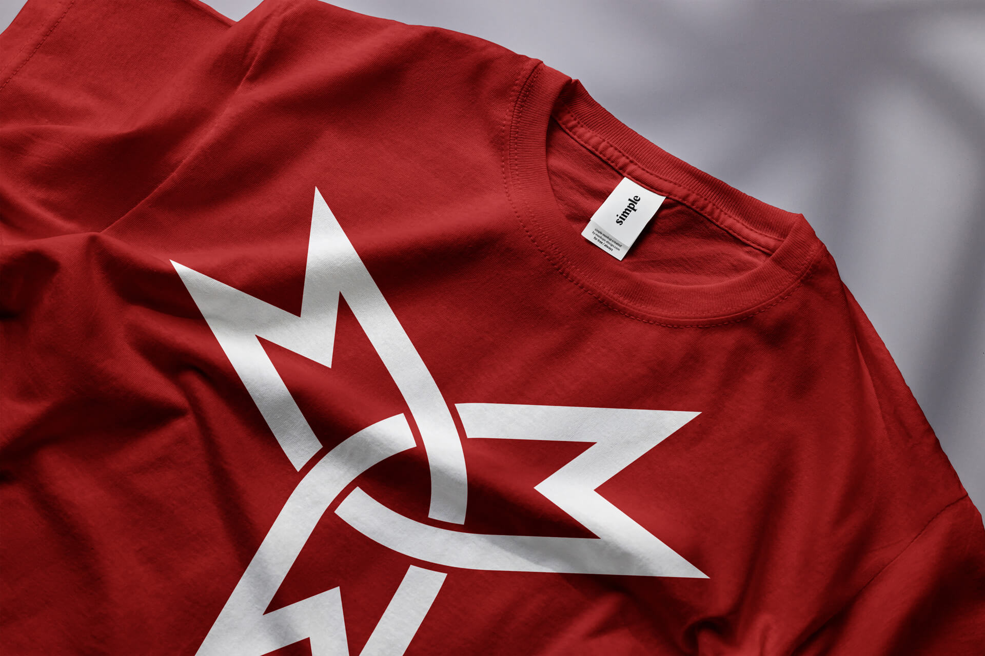
From there, I built out the brand guidelines, covering colours, typography and how to use the logo, so the identity stays consistent wherever it appears. A t-shirt design shows how the mark carries over to apparel.
Value delivered
In 2 weeks, Myriad Conceptions went from having no brand to a complete identity with one mark that tells two stories at once: the range of what they do, and where they come from.
It’s simple enough to remember and precise enough to suit the work. With the guidelines in place, the brand can stay consistent as the business grows, from proposals to apparel.