Fairwind Flower Farm

Fairwind Flower Farm was founded by Melissa, a culinary professional turned flower grower and beekeeper. What started as a small venture to support her honey bees grew into a busy family business: seasonal bouquets and jars, custom pieces, wedding and event flowers, a flower shop, Fairwind honey and Sip N’ Snip workshops.
Melissa came to me for Fairwind’s first real brand. She wanted it to feel bright, welcoming and close to nature, just like the farm itself.
The challenge
A business with six different offerings has a problem most small brands don’t. Each part of Fairwind reaches people in a different place: a couple planning their wedding, a shopper picking up a jar of honey at a local store, a family stopping at the farm stand, a group booking a workshop. Each one needs to feel right on its own, and all of them need to feel like the same farm.
Without a system, a business like this tends to drift into six mini-brands, each one designed whenever it was needed. The challenge was to build one identity that could flex across all of them, from honey labels to wedding signage to Instagram, without losing the warmth that makes Fairwind special.
We explored a few different design directions before landing on the right one, and that back-and-forth was an important part of getting there.
What I did
- Logo
- Icon set for six offerings
- Colour palette
- Typography
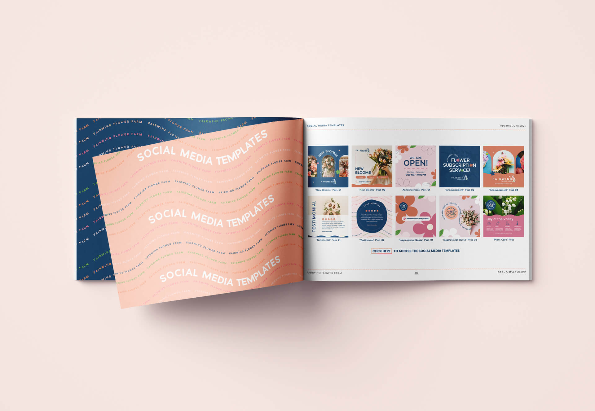
- Brand style guide
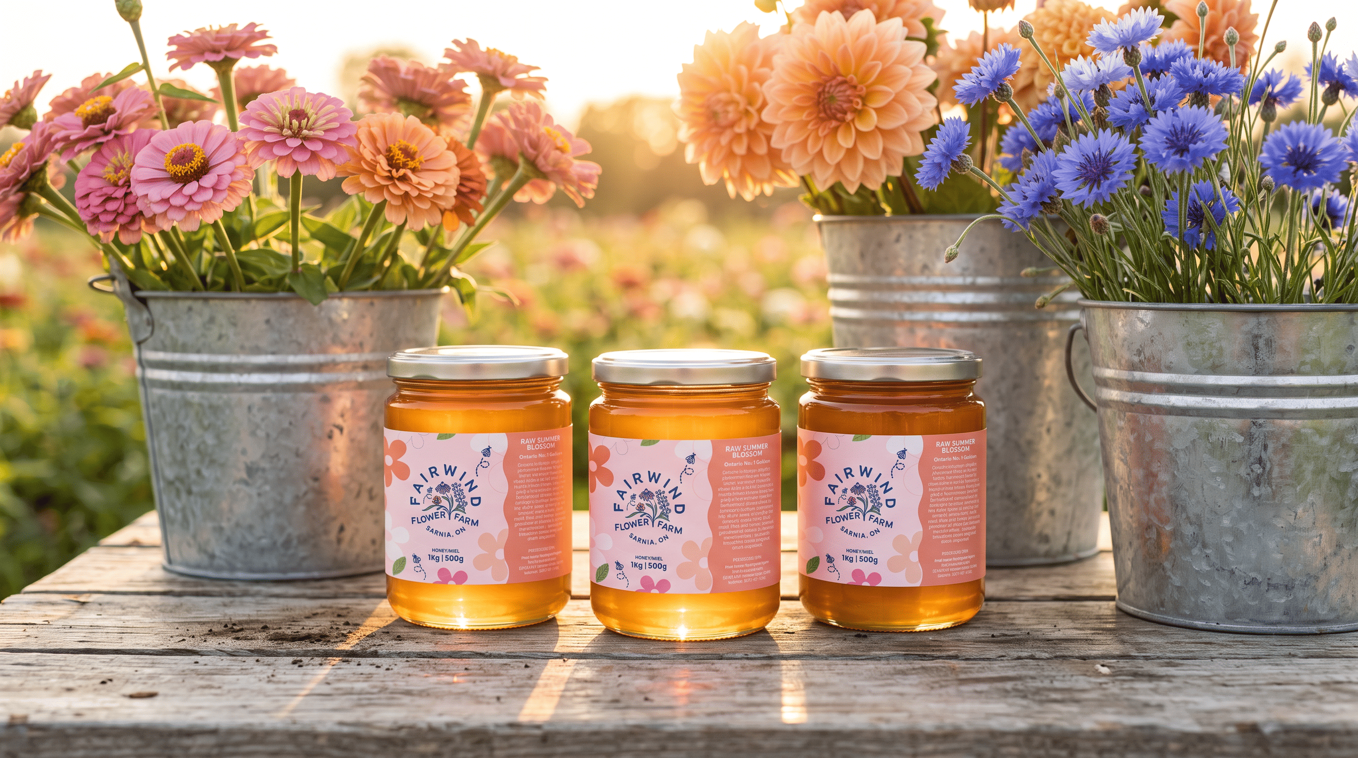
- Honey labels
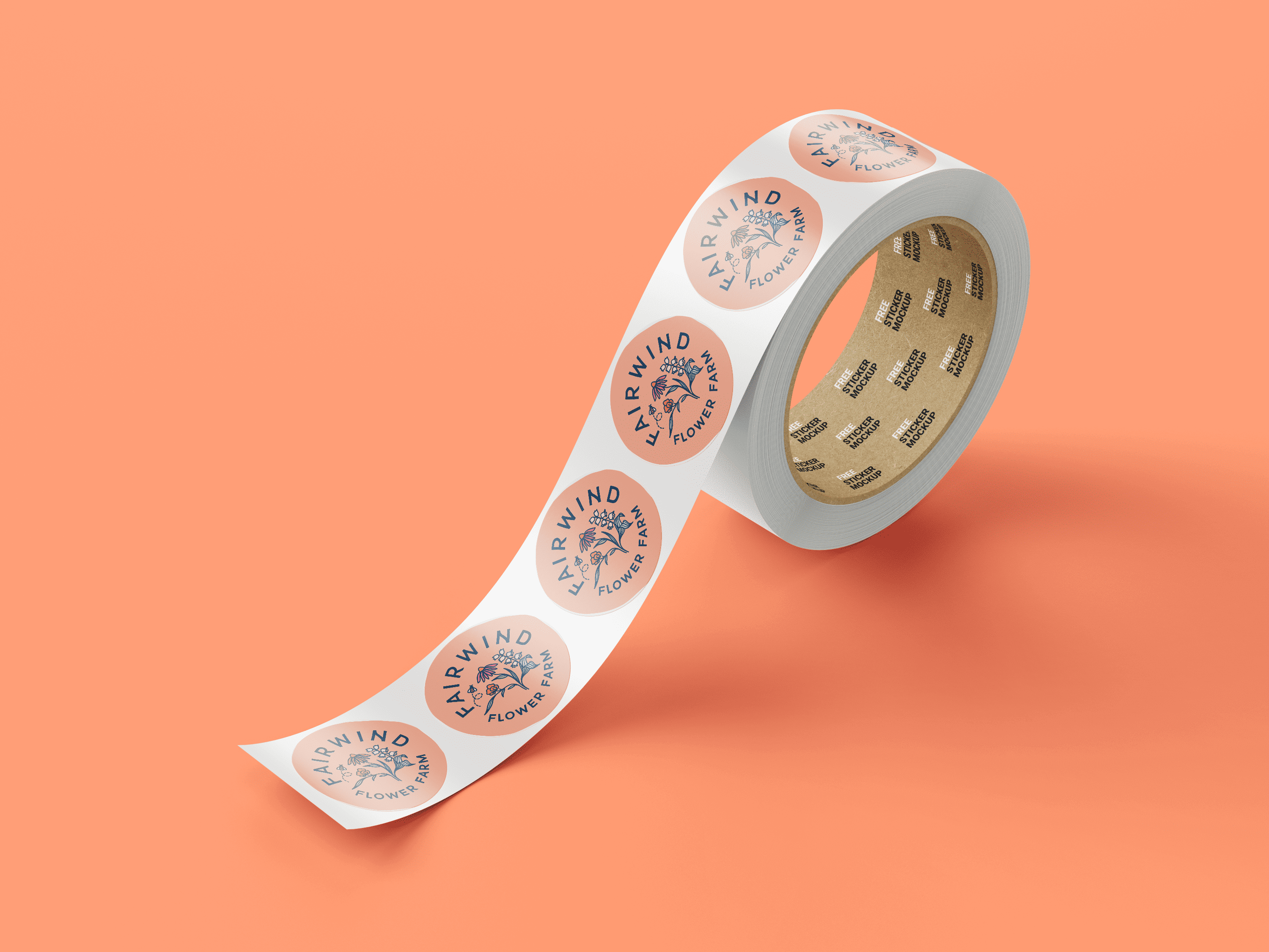
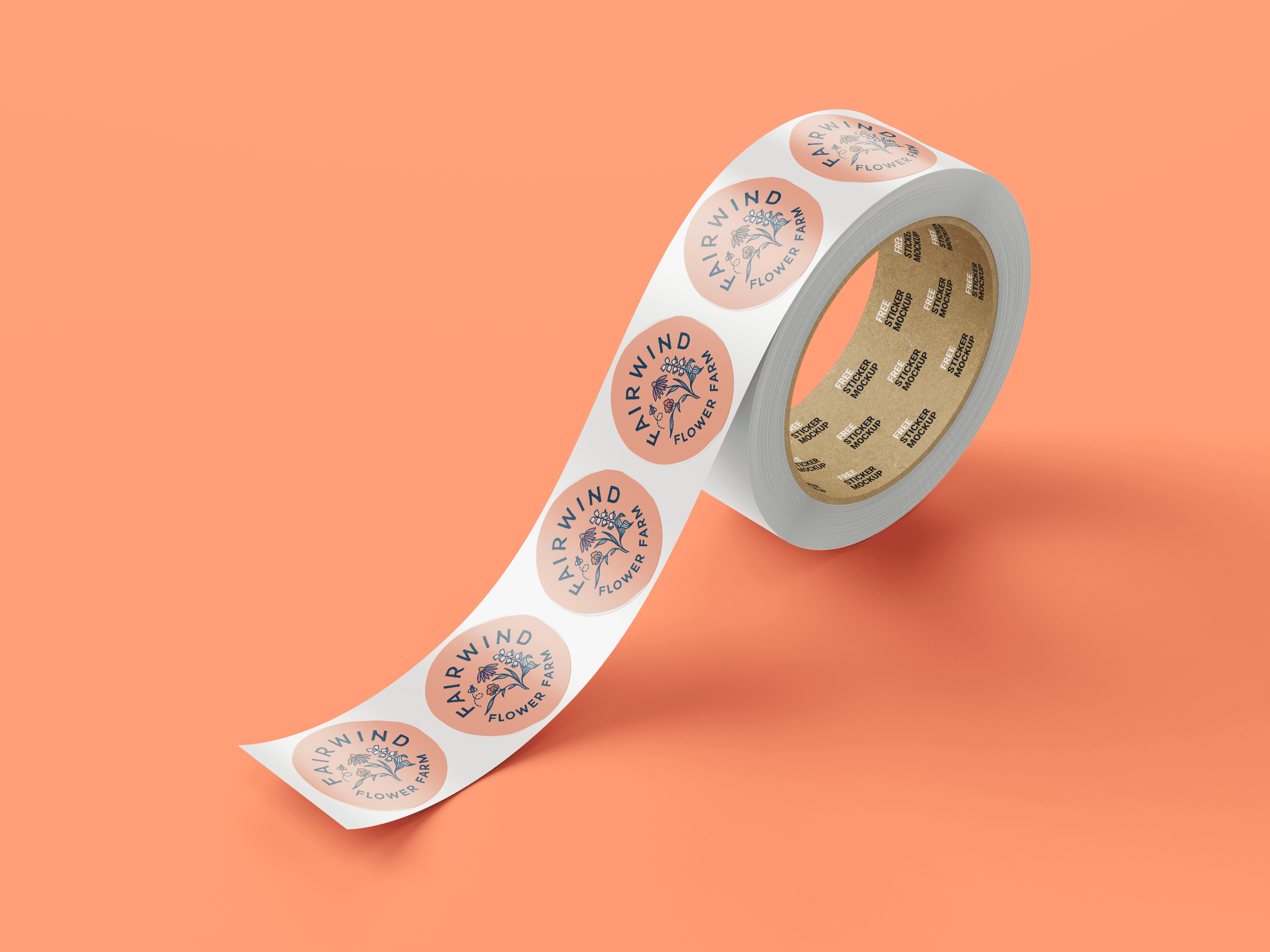
- Packaging
- Signage
- Business cards and stationery
- Social media templates
The solution
I started with a hand-drawn logo that brings Fairwind’s two roots together: the flowers and the bees. It feels made by hand rather than by a template, which suits a farm where everything is grown and gathered on site.
The colour palette pairs bright pinks and soft peach tones with cool, earthy blues. The warm colours carry the energy of the blooms, and the blues ground them, so the brand feels lively without tipping into sweet.
The part that holds the whole business together is a family of six icons, one for each offering: Bouquets & Jars, Custom Pieces, Weddings & Events, Flower Shop, Fairwind Honey and Sip N’ Snip Workshops. They share the same hand-drawn style and palette as the logo, so each offering gets its own identity while still clearly belonging to Fairwind. A couple browsing wedding flowers and a shopper picking up honey in a local store are seeing the same farm, just a different door into it.
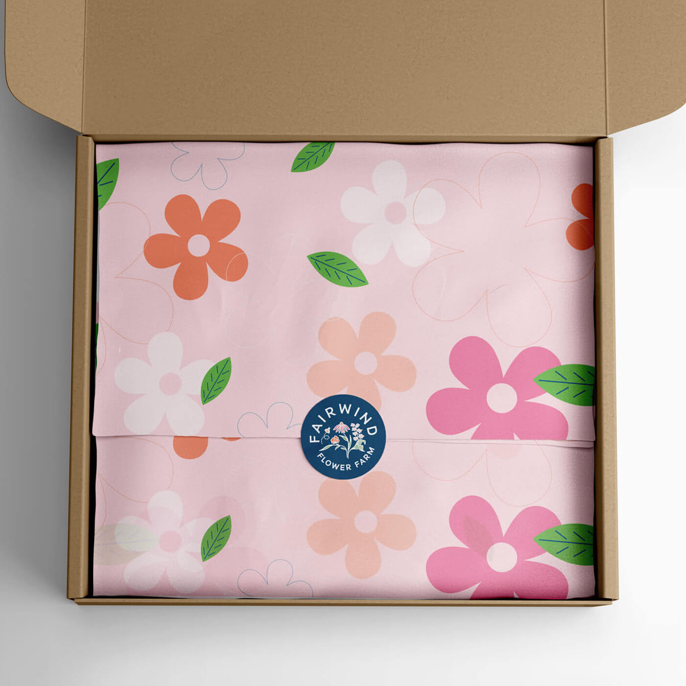
From there, the brand extends to everything Fairwind uses day to day: honey labels made to stand out on a store shelf, packaging, farm stand and market signage, business cards and stationery, and social media templates. The style guide ties it together, showing how each piece works so the brand stays consistent as the farm keeps growing.
Value delivered
In 4 to 6 weeks, Fairwind went from a growing business without a real brand to a complete identity that works across every part of the farm.
The icon system gives Melissa room to grow. When she adds a new offering, it can slot into the same family instead of becoming a one-off design. And with the style guide and templates in place, the farm can show up consistently at the stand, at markets, in stores and online, without starting from scratch every time.