

Most logos are judged in about four seconds. Usually it happens in a meeting, on a white slide, by a room full of people who aren’t the customer.
Someone likes the colour. Someone’s spouse thought it looked like a bank. Someone asks if the leaf could be a little bigger, and whether it could also hint at the mountains, since that’s where the founder grew up.
None of that is unusual, and none of it is anyone’s fault. Most business owners only make a logo decision once or twice in their career. Nobody teaches you how to judge one, so you fall back on taste and hope for the best.
The trouble is that a logo judged on taste ends up being asked to do things it can’t do, and judged on things that don’t matter much. So before getting into how to pick a good one, it helps to be honest about what a logo is actually for.
What a logo is actually for
A logo has one main job: to be recognized. It’s a signature, not a summary.
Think about how people actually come across it. A glance at a truck in traffic. A tiny icon in an inbox. A sign they drive past on the way to work. Nobody stops to decode what it means. They see it, and over time they connect it to you.
This is where expectations usually go wrong. A logo doesn’t arrive full of meaning. It earns meaning through every good experience someone has with the business behind it. Most of the logos we think of as brilliant are simple marks that got attached to a lot of good work over a lot of years.
So a good logo needs to do a few practical things well:
- Be easy to recognize. It’s distinct enough that people don’t confuse you with the business down the road.
- Be easy to remember. It’s simple enough that someone could roughly picture it after a glance.
- Work everywhere you show up. Small and large, in one colour, on a screen, on a uniform.
- Feel right for who you are. It sets the right tone for your clients, even if it doesn’t spell out what you do.
Notice what’s not on that list: explaining your services, telling your founding story or including a symbol for every value. Those jobs belong to your words, your website and your work. Asking a logo to carry them is how you end up with a mark that’s trying to say everything and gets remembered for nothing.
What a logo can’t do
A great logo is worth investing in. It’s also one of the most over-expected pieces of a brand. Here’s what it can’t do on its own.
It can’t explain what you do. If people need to understand your services, that’s the job of your headline, your website and your sales conversations. A logo that tries to illustrate your services usually ends up cluttered and still doesn’t explain them.
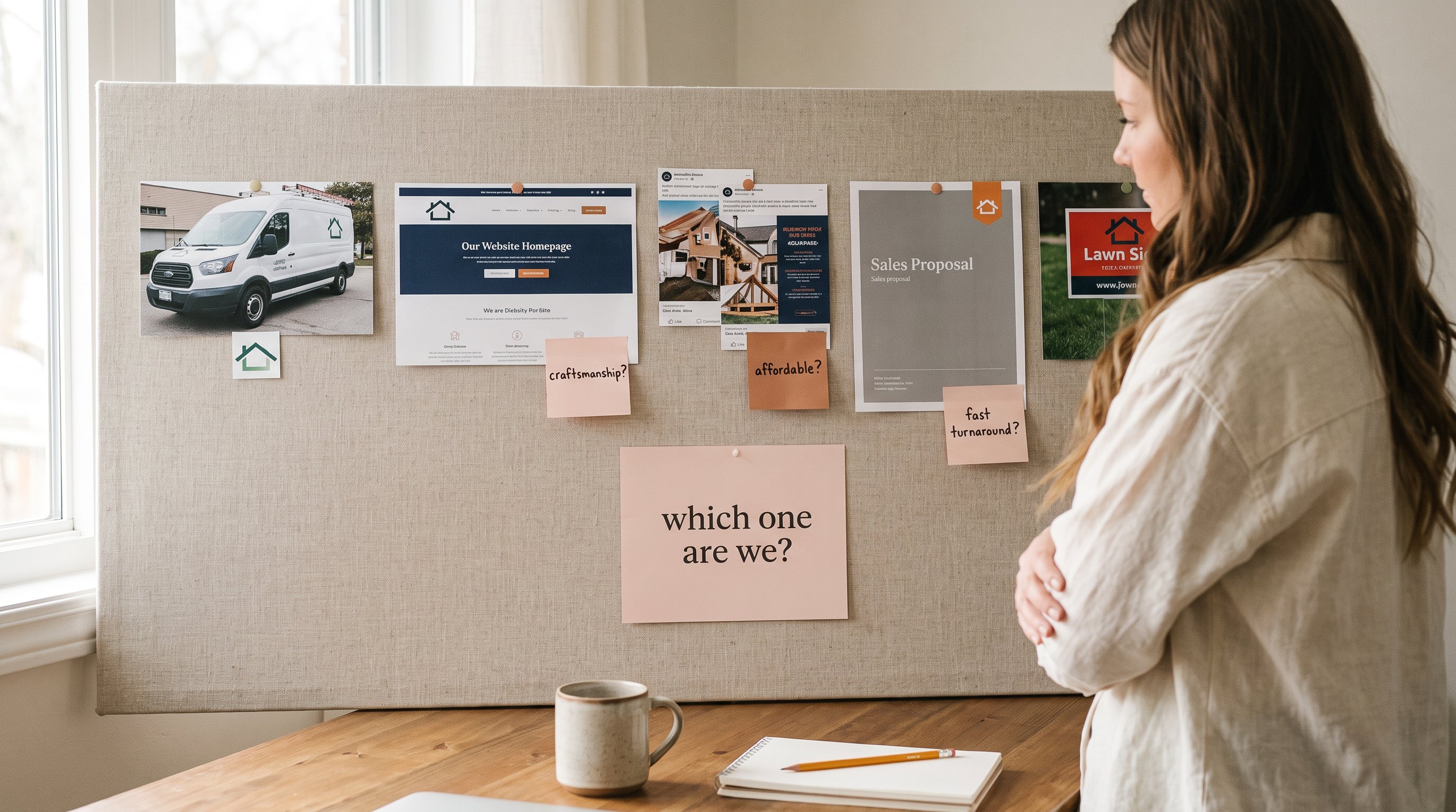
It can’t make you premium by itself. A polished mark helps, but if your website, proposals and pricing all say “budget option,” a sophisticated logo just looks like it wandered in from another company. Premium is a pattern people notice across everything, not a single piece.
It can’t fix a positioning problem. If buyers can’t tell why they should choose you over the alternatives, a new logo won’t tell them. That’s a decision you have to make first. I’ve written more about it in Brand Positioning Is a Decision, Not a Sentence.
It can’t fix inconsistency. A brand-new logo used five different ways is still a brand used five different ways. If your marketing isn’t adding up, the issue is usually the system around the logo, not the logo itself. More on that in Why Your Marketing Isn’t Adding Up.
It can’t feel familiar on day one. This is the one that trips up the most people in review meetings. A new logo is, by definition, something nobody has seen before, and unfamiliar can easily feel wrong. That’s not a reason to reject it. It’s a reason to judge it more carefully, which is what the next section is about.
How to judge a logo concept
A regional accounting firm came to me to rebrand after 20 years. The first concept was bold and modern, built around a distinctive symbol that represented openness and forward momentum. The owner loved it. The rest of the leadership team thought it felt too unfamiliar, and the requests started rolling in: softer colours, a more traditional font, and a generic icon that everyone would recognize.
I didn’t make the changes right away. Instead, I walked them through the concept against their actual business goals. We looked at the clients they wanted to attract, the competitors they needed to stand apart from, and what their current brand was saying compared with what they wanted it to say.
Somewhere in that conversation, the team realized they’d been judging the concept on personal taste rather than on whether it solved the problem. Some of their concerns were legitimate, mainly about readability and versatility, so we refined the original direction to address those. We kept the distinctive elements that made it memorable.
The result was a brand that felt credible to the leadership team without looking like every other accounting firm in the market.
That’s the heart of judging a logo well: learning to tell the difference between a concept that feels unfamiliar and one that actually isn’t working. Here’s how I’d approach it.
1. Judge it against the brief, not your taste. Before anyone says “I like it” or “I don’t,” go back to what the logo is supposed to do. Does it suit the clients you want to attract? Does it set you apart from the competitors you’re compared to? Does it feel like the business you’re becoming, not just the one you’ve been? A concept can pass all three and still not be your favourite colour.
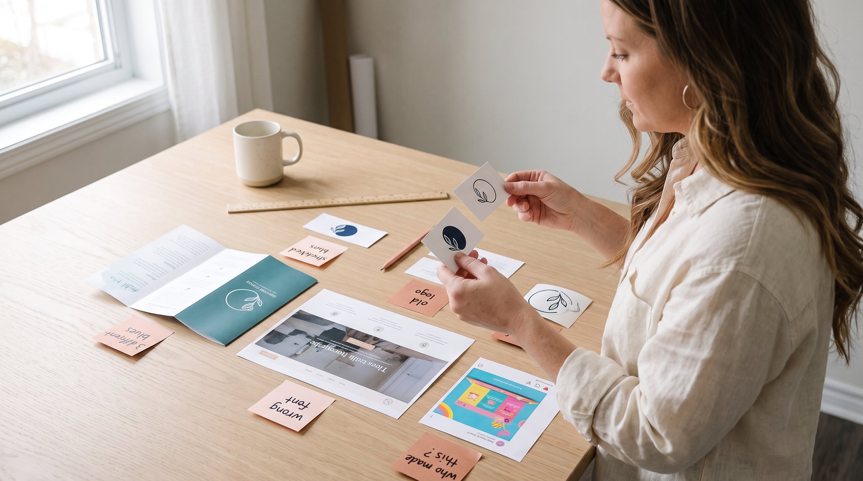
2. See it in real life, not on a white slide. A logo floating alone on a presentation screen tells you very little. Ask to see it on the things it’ll actually live on: your sign, a proposal cover, your website header, a social profile picture, an invoice. That’s where you’ll find out whether it works.
3. Test it small and in one colour. Shrink it to the size of a browser tab icon. Print it in black only. If it falls apart, that’s a real problem worth fixing. If it holds up, that’s a good sign, whether or not it’s love at first sight.
4. Ask what specifically feels off. “It doesn’t feel right” isn’t feedback a designer can act on, and it often just means “it’s new.” Push for specifics. Is it hard to read? Does it feel wrong for your clients, or just different from what you’re used to? Real issues are worth solving. Unfamiliarity usually fades in a few weeks.
5. Picture it in five years. You’ll see this logo thousands of times. The question isn’t how it makes you feel in a meeting today. It’s whether it’ll still fit the business when it’s on every truck, proposal and screen you own.
The traps in logo feedback
Even with a good process, a few traps catch almost everyone. Knowing them ahead of time makes them a lot easier to avoid.
Design by committee
Everyone on the team gets a say, and everyone asks for one small change. Each request seems reasonable. Together, they sand off everything distinctive, until you’re left with the average of everyone’s preferences. That’s usually a logo nobody dislikes and nobody remembers. Gather input from your team, but decide upfront who makes the final call, and ask people to give feedback against the brief rather than their taste.
Polling friends and family
It’s tempting to text the concepts to your sister, your accountant and your group chat. They mean well, but they’re not your clients, and “Which one do you like?” only ever gets you an opinion on taste. If you want outside input, show it to a couple of people who look like your ideal client, and ask what kind of business it makes you seem like.
“Can it also show...”
The mountain, the founder’s initials, the year you opened, a nod to your first location. Every addition dilutes the mark a little more. If an idea is important to your story, there are better places to tell it: your About page, your website, your client conversations. Let the logo stay simple enough to be remembered.
Judging the colour before the shape
Colour gets the strongest reactions, and it’s the easiest thing to change. If you hate the green, you might reject a great shape because of it. A good habit is to look at concepts in black and white first. If the form works, colour can be refined. If the form doesn’t work, no colour will save it.
Comparing it to logos with decades behind them
A new logo will never feel as solid as the ones you see every day, because those have had years, sometimes decades, of repetition. Nobody loved those marks on day one either. Compare a new concept with your competitors and with where you want to be, not with brands people have been looking at their whole lives.
Using AI-generated logos as the brief
AI image tools can be genuinely useful for exploring a direction or showing a designer the kind of feel you’re after. Just don’t treat what they produce as a logo to copy or refine. They tend to produce generic results, they can’t make the strategic choices your brand needs, and they can echo existing marks in ways that create trademark headaches later. Use them to start a conversation, not to finish one.
After you choose
Picking the logo is the decision. What happens next decides whether it works.
Resist the urge to keep tweaking. Almost every owner feels a wobble in the first few weeks: “Should the icon be a bit bigger? Was the other colour better?” That’s normal, and it passes. A logo that keeps changing never gets the repetition it needs to become recognizable.
Make sure you own it properly. Before it goes on anything expensive, check that nobody in your industry and region is already using something too similar. A quick trademark search is a good start, and an intellectual property lawyer can tell you whether registering it makes sense. Make sure you also get the full set of files you’ll need: vector versions, the stacked and horizontal layouts, an icon, and one-colour versions.
Roll it out everywhere at once, or close to it. A new logo next to the old one on your website, signs and proposals confuses people and slows recognition. If the whole switch can’t happen at once, set a short timeline with an end date. I’ve covered how to roll out a new identity in Do You Need a New Brand Identity?
Let it earn its meaning. The logo you chose won’t feel like “you” right away. It becomes yours through every project you finish, every client you help and every time someone sees it next to good work. Give it a year before you judge it. Most of the logos people admire looked like nothing special on day one.
The question to bring into the room
The next time someone puts logo concepts on the screen, try swapping “Do I like it?” for a better question: “Will this help the right people recognize us, remember us and choose us?”
The first question gets you taste. The second gets you a decision you can stand behind, even if the answer takes a few weeks to start feeling comfortable.
That’s the part of the process I care most about. Good creative direction isn’t about convincing clients to like a design. It’s about helping them tell the difference between a concept that feels unfamiliar and one that isn’t working.
If you’re about to make a logo decision and want a second set of eyes before you commit, I’m happy to help.
Fractional Creative Direction
For you if your brand is ready to roll out, and you want someone senior making sure it's done right.
See how it works