Bluewater Dance Academy

Bluewater Dance Academy opened in Sarnia, Ontario in 2016. By Season 10 it had about 250 dancers aged 3 to 18, a competitive team of 70 and 15 instructors. The logo was still the one a neighbour had designed for them as a favour when they opened.
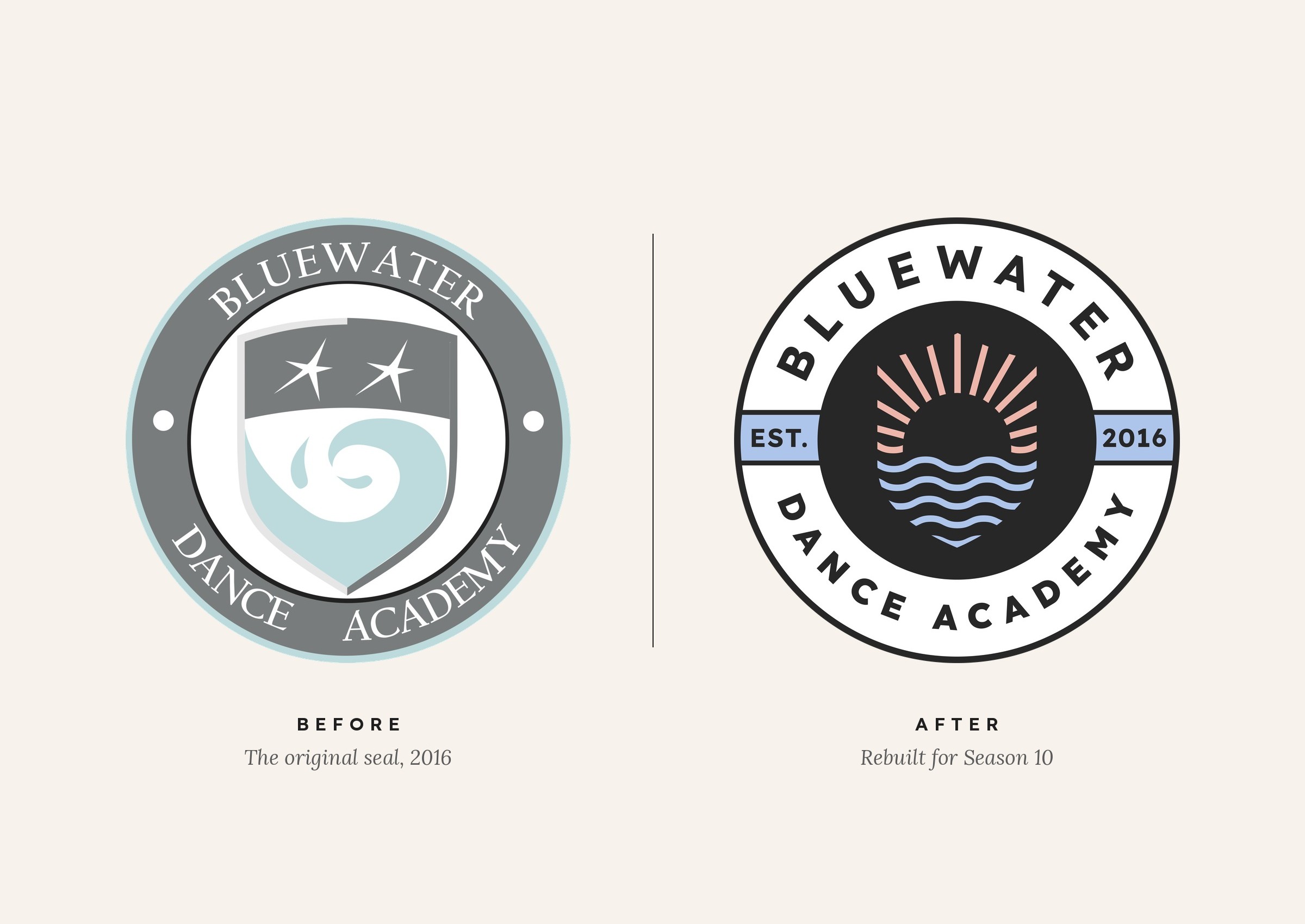
That original logo was a collegiate-style seal: a shield with a wave and two stars, one for each owner, inside a grey ring with the studio's name in a serif typeface. Over the years, other versions had joined it, including a crest, two versions in a different typeface and a separate mark for the competitive team's uniforms. Each season's merch got its own design too, so the studio looked a little different every year.
Emily and Skyler, the owners, were clear about what had to stay. The blue, the black and white, and the wave were non-negotiable, and they didn't want a dancer silhouette like most studio logos. They also wanted a symbol their dancers could wear that people would recognize on its own. Their goal was to be seen as the most professional studio in Sarnia, attracting more competitive dancers while still welcoming the youngest ones. In the discovery questionnaire, they described the brand they wanted as "elite."
The challenge
"Elite" was the word I wanted to look at closely. BDA has a competitive team that holds auditions, and the owners wanted that program taken seriously. But most of their dancers are recreational, and many of them are three, four and five years old. In our first meeting, Emily and Skyler shared advice they'd been given years earlier: don't put your best dancers on the front page of your website, because a mom who's new to dance will look at it and think her kid can't do that.
I wanted to know what parents in Sarnia actually look for, so I read through public reviews of local dance studios on Google, Facebook, Yelp and ThreeBestRated. The instructors and the feeling of community came up more than anything else. The complaints were about hidden fees, poor communication and studios that felt cliquey or too competitive. I also reviewed five local competitors and built personas for the families BDA serves, from a working mom with three young daughters, to a ten-year-old who wants to start competing, to parents worried their son would be the only boy in class.
That made the real challenge clear. BDA needed to look like the most serious training studio in the area without telling a nervous new family that it wasn't for them. The brand had to read as respected and professional, and still feel open to everyone who walks in.
What I did
- Discovery questionnaire and workshop
- Parent review analysis
- Competitor research
- Client personas
- Mission, vision and values
- Brand voice and messaging pillars
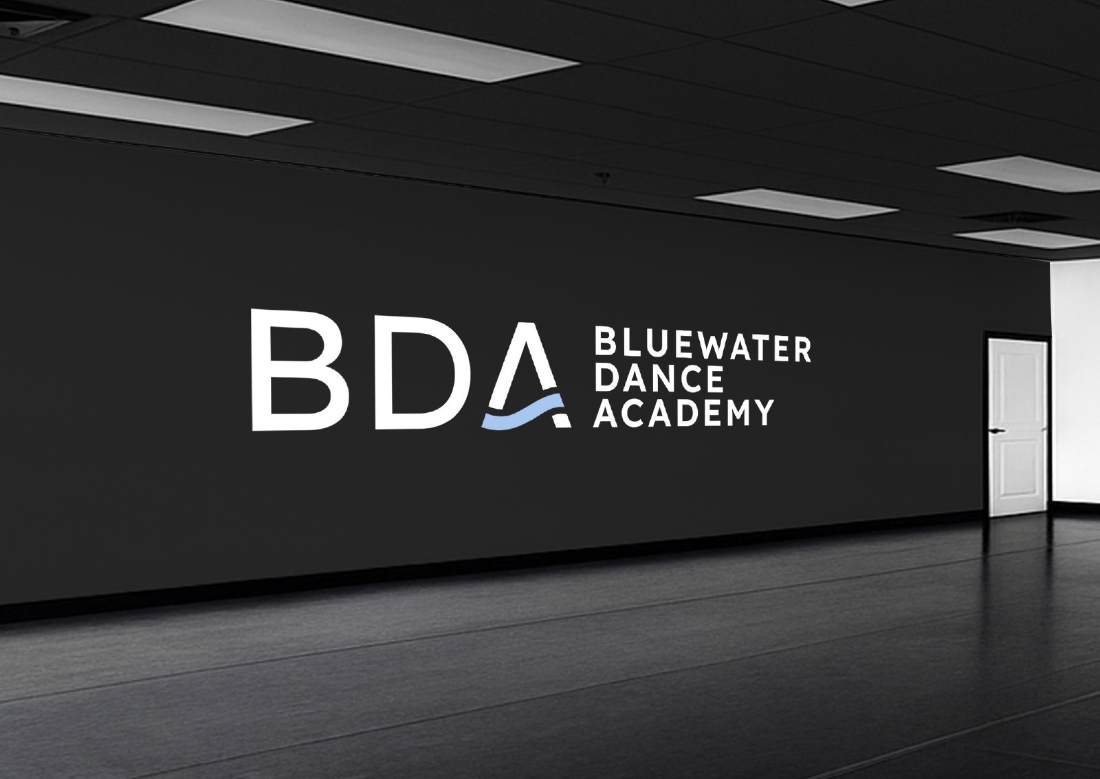
- Logo system: primary seal, simplified seal, monogram, horizontal wordmark and icon
- Colour palette and typography
- Patterns and gradients
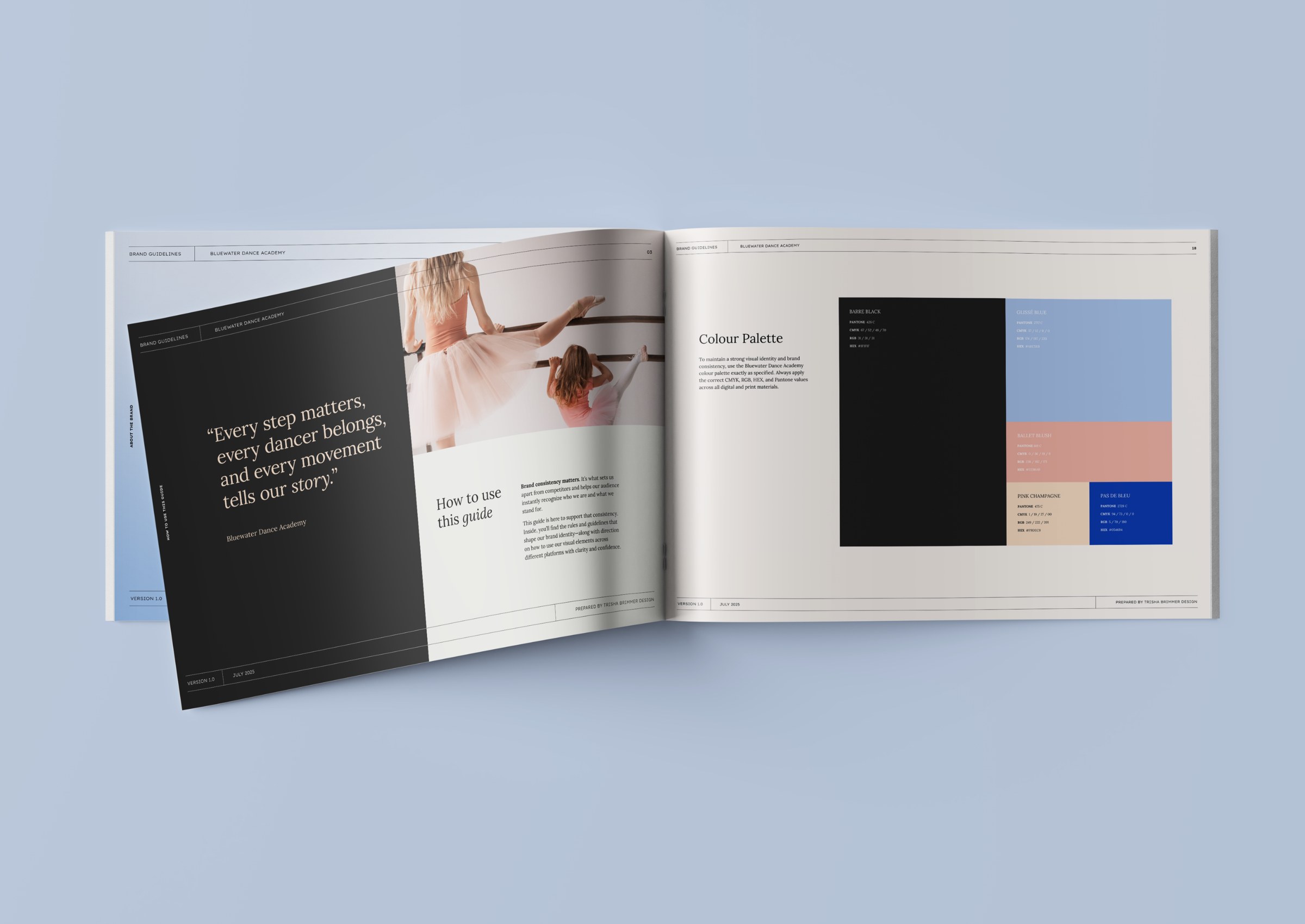
- Brand guidelines
- Social media templates
- Studio signage and wall graphics
- Launch campaign
The solution
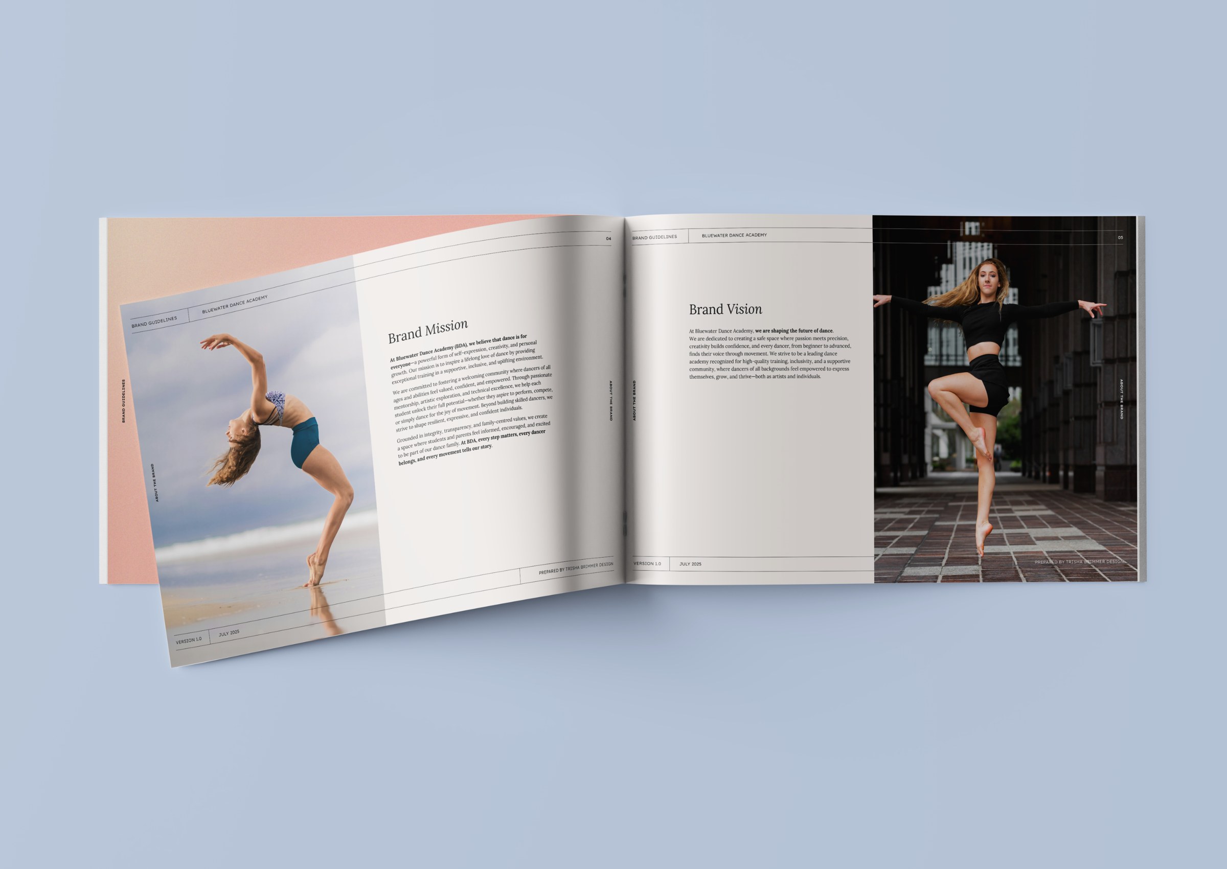
The foundation came first. I wrote BDA's mission, vision and values from the discovery work and the research, and each value answers something parents told us. Integrity & Transparency responds to the frustration with hidden fees and poor communication. Excellence with Balance is how the brand talks about serious training without sounding intimidating. Inclusivity & Belonging speaks to families who worry their child won't fit in. The voice guidelines also list words to avoid, including "exclusive" when it means shutting people out, and intimidating or overly competitive language.
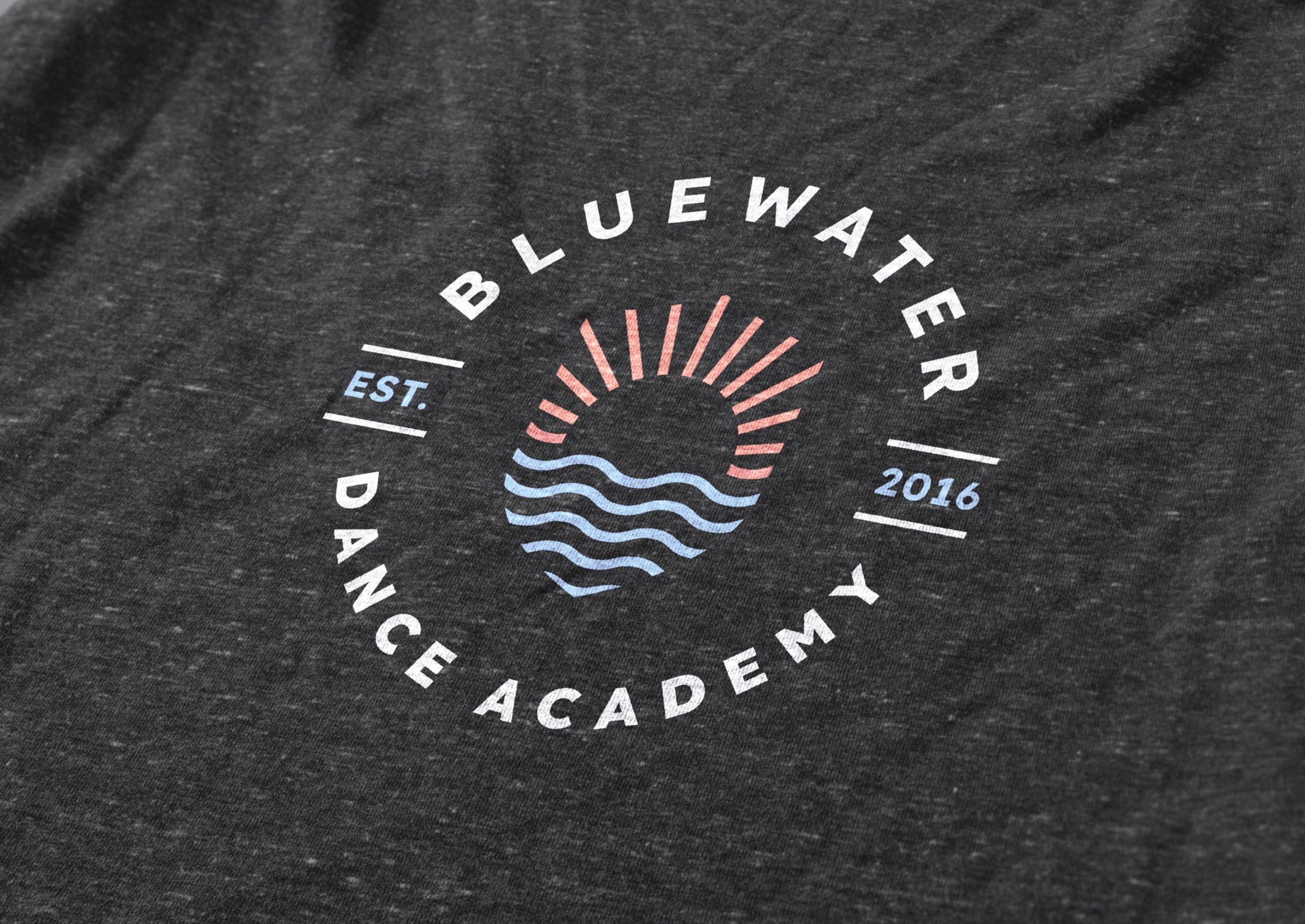
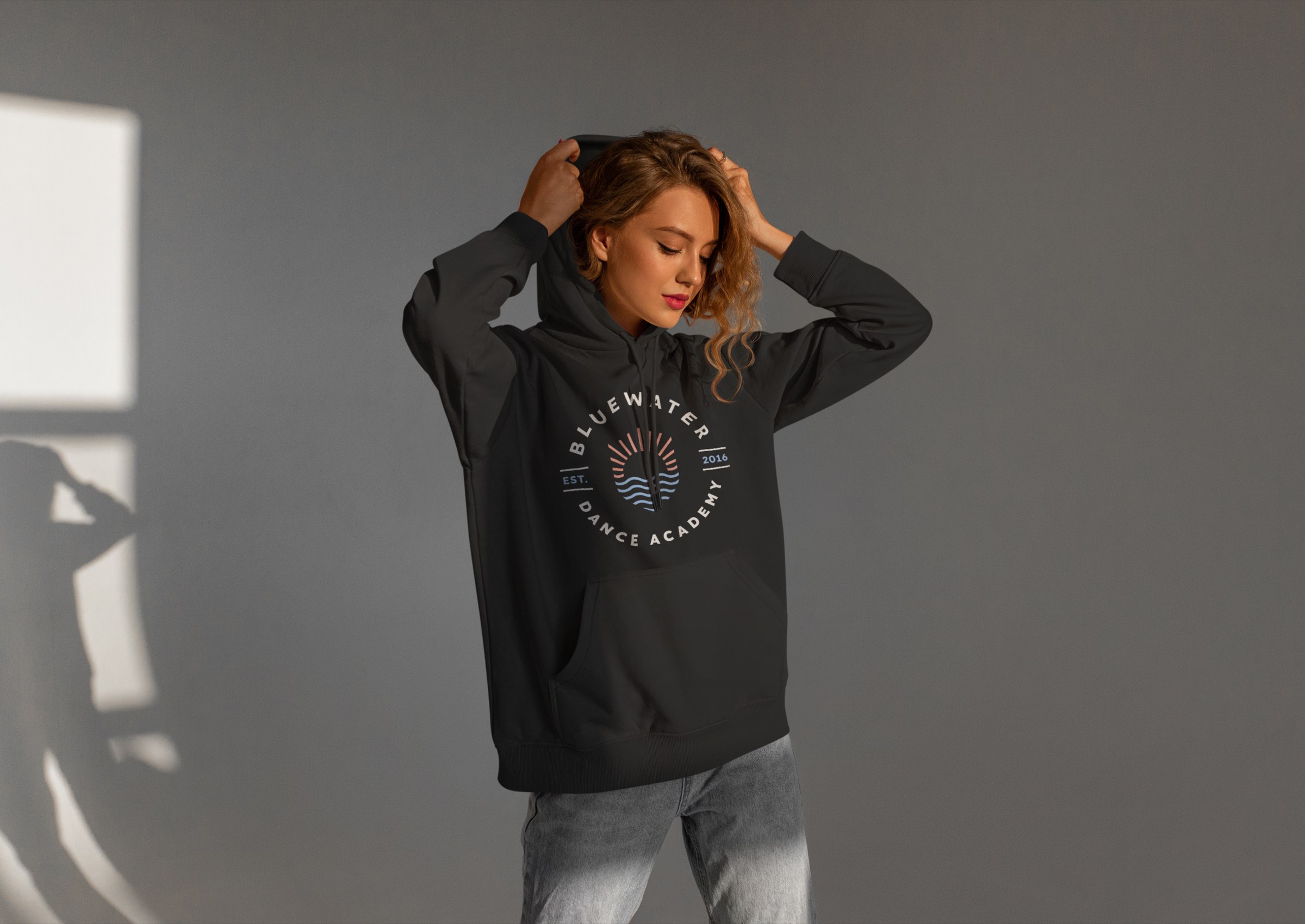
Then the logo. Instead of replacing the old seal, I rebuilt it. The seal format stays, with the studio's name around the ring and the year it was founded. The shield shape from the old crest became the outline of the new icon. The two stars became the rays of a sun rising over layered waves, a nod to Lake Huron, where Emily and Skyler grew up and where Sarnia sits. The serif type the owners felt looked dated was replaced with Lexend, a clean, rounded sans serif. Around the main seal, I built a simplified seal for small sizes, a horizontal wordmark, and a BDA monogram where a wave forms the crossbar of the A. The monogram and the icon are the symbols the owners asked for, simple enough to put on a pair of dance shorts and still be recognized.
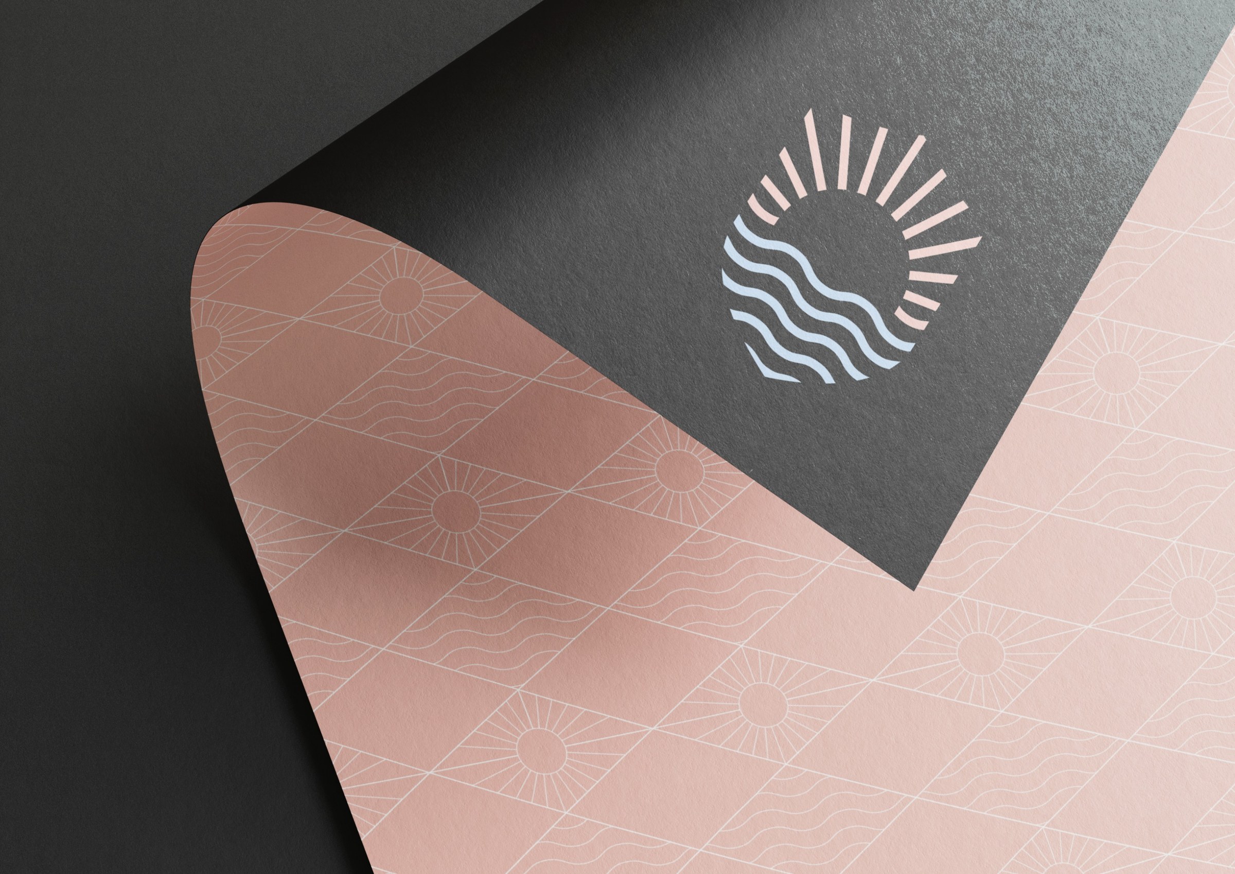
The blue moved from the old robin's egg teal to a softer, more universal blue. It still ties to the lake, and it keeps the brand from leaning too feminine, which mattered because boys are welcome at the studio too. Black anchors the palette and gives it the weight of a serious training program. I added two warm tones for approachability and a deeper blue for contrast, and gave each colour its own name: Barre Black, Glissé Blue, Ballet Blush, Pink Champagne and Pas de Bleu. A sun-and-wave pattern and soft gradients round out the system, and the brand guidelines show the studio how to use all of it.
The rebrand also lined up with a renovation the studio had planned for June. I designed graphics for the building's exterior, the reception area and each studio, and gave each room its own feel, which the owners had asked for. The BDA monogram now covers a full wall in Studio A.
The last piece was the launch. We planned a two-week rollout on Instagram and Facebook that brought the community along before anything was revealed: a teaser, a look back at the studio's first nine years, a post about why the brand was changing, a countdown, and then the reveal in July as the studio reopened for summer classes. I also built a set of Canva templates for announcements, events, reminders and quotes, so the owners can post quickly and every post still looks like BDA.
Value delivered
In about five months, BDA went from a logo designed as a favour and a different look every season to a complete brand system with a strategy behind it. The owners have a mission statement they feel describes them, a seal that keeps what their families already recognized, and symbols their dancers can wear.
The research gave them something beyond the design. They know what Sarnia parents look for and what drives them away, and the values and voice give them a way to talk about their competitive program without making new families feel left out.
With the guidelines and templates in place, the studio's merch, signage and social posts all come from the same system, so each new season can build on the brand instead of starting over.
Working with Trisha was awesome. We were nervous, obviously, and really excited, because we didn't want to lose what we'd created. Trisha made it really easy to keep the things that were important to us and also evolve our brand. The research is the biggest thing that stands out. I remember the first couple of emails and thinking, this is actually crazy, the amount of work put into things we never would have thought about. The organization, the detail, it was incredible. We were texting each other, like, wow, we did not expect that. She asked thought-provoking questions that really brought us together. We couldn't always put into words how we felt, especially with our mission statement, and she put it together with a bow for us. Same with the logo. She kept our old logo but totally transformed it, and kept the same vibe. I couldn't have asked for anything better.